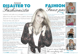
To attract my audience i used direct mode of address in most of my images. This is because i wanted my magazine to be able to stimulate an interaction with every individual reader. On my front cover there is a central image which follows the conventions of a fashion magazine. It helps the magazine to look professional and effective as the cover lines are moulded around the sides. This is the same for my double page spread. From my research fashion magazines tend to have an interviews about an idol. The interview is moulded around my models shape which is following the conventions. Not only is it doing this but it looks effective and attractive which encourages my audience to stop and read. On my contents page i used more than one image because i wanted my audience to see the different outfits that are featured inside my magazine, which would help attract them because they will be interested in fashion and looking good.
I used costumes in my magazine to interpret the genre of my magazine. My model wore clothes and jewellery that is related to the season and fashion. This made it clear that my magazine was a fashion magazine which helped to attract my target audience. My model is very thin and beautiful which is stereotypical for a fashion magazine. This follows the conventions of other magazines.
Throughout my magazine i used superlatives such as 'free' and 'exclusive' to help attract my target audience and interest new fans. These words make the audience think that they are getting something original and unique which encourages them to buy the magazine.
The register i used in my magazine was standard English as this was appropriate for my target audience. This is because i expect my target audience to be educated.
Throughout my magazine i used the same colours. As my magazine was a 'winter special' i did some research on other magazines to help me pick my colours. Here is an example of a magazine i looked at for conventions.
I think that the colours i used a stereoptypically wintery and relevant for the season. This helps attract my audience as the colours represent winter for example bluue connotes ices and white connotes snow etc. I think that the colours used are bright and attractive colours that stand out. This is important as magazines are placed next to their competitors, so consumers will choose the magazine with the most attractive front cover.
The variety of size/colour/font of my coverlines helpes attract my audience as it creates excitement and enigma as to whats inside. They make my audience want to buy the magazine and read more.
The price of my magazine is fairly reasonable and cheaper than the majority of fashion magazines. From my research the majority of my audience said they would pay between 1 and 2 pounds. So with my magazinebeing in competition with others and being priced 2pounds and others being priced at 3 and 4 my magazine is more likely to become more popular and therefore more attractive.


No comments:
Post a Comment