Thursday, 16 December 2010

Looking back at your preliminary task, what do you feel you have learnt in the progression from it to the full product?


Planning and preparation was really important so that i could understand the various forms and conventions of different fashion magazines.  During my preliminary task, i did not research enough and therefore wasn't full aware of the conventions and how my magazine should have been layed out.  Since creating my school magazine my knowledge of using Photo shop has increased considerably. For example I now know how to make elements of my magazine stand out more changing the saturation/contrast/brightness of my images. In addition to this, I learnt how to select parts of photos using the quick selection tool in order to cut things out. An example of this would removing the background from my images, which makes my magazine look more professional and effective. I've also learnt how to download newer more interesting fonts, increasing the visual appeal of my magazine. As well as this, the complexity of my page layout has increased as I've done more research.  For my school magazine i didn't do as much research, so therefore my magazine follows the conventions more.  On my school magazine the fonts i used for my cover lines don't look as effective and appropriate as my fashion magazine. I think this is because my knowledge on fonts as increased stupendously. 

Overall my understanding of the software has improved greatly throughout this project because at the start I'd barely used Photo shop and now I have produced a professional looking magazine using it.  I also feel that during my 2nd project i came more aware of my target audience.   

What have you learnt about technologies from the process of constructing this product?

During the construction of my magazine there has been a few problems accessing technology which has made it hard to produce work of a high standard in these challenging circumstances.  Spite these problems i have used laptops at school and my own computer to create my magazine. The majority of my work was done on my own computer. 

 I created my magazine using desktop publisher.

To transfer my work from one computer to another a used a memory stick as this was more efficient than emailing myself my work.

To take pictures for my magazine i used my own camera from home (samsung).  To edit my images i used a programme called Adobe Photo shop Elements 2.0
Below of some of the images that i edited
I created my fonts on dafont.com as this website contained the font that i wanted to use for my magazine which is found on the double page spread.
I then edited my font which i had found on dafont.com on fireworks.
In addition to this I created a blog account using “Blogger” to post all of my research and evaluation.


To transfer my magazine content on to my blog i print screened them from viewing them in print preview and then copied them onto paint before saving and uploading onto my blog.

Tuesday, 14 December 2010

How did you attract/address your audience?


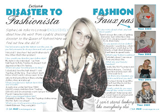
To attract my audience i used direct mode of address in most of my images.  This is because i wanted my magazine to be able to stimulate an interaction with every individual reader.  On my front cover there is a central image which follows the conventions of a fashion magazine.  It helps the magazine to look professional and effective as the cover lines are moulded around the sides.  This is the same for my double page spread.  From my research fashion magazines tend to have an interviews about an idol.  The interview is moulded around my models shape which is following the conventions.  Not only is it doing this but it looks effective and attractive which encourages my audience to stop and read.  On my contents page i used more than one image because i wanted my audience to see the different outfits that are featured inside my magazine, which would help attract them because they will be interested in fashion and looking good.
I used costumes in my magazine to interpret the genre of my magazine.  My model wore clothes and jewellery that is related to the season and fashion.  This made it clear that my magazine was a fashion magazine which helped to attract my target audience.  My model is very thin and beautiful which is stereotypical for a fashion magazine.  This follows the conventions of other magazines. 
 Throughout my magazine i used superlatives such as 'free' and 'exclusive' to help attract my target audience and interest new fans.  These words make the audience think that they are getting something original and unique which encourages them to buy the magazine. 
 The register i used in my magazine was standard English as this was appropriate for my target audience.  This is because i expect my target audience to be educated. 
 Throughout my magazine i used the same colours.  As my magazine was a 'winter special' i did some research on other magazines to help me pick my colours. Here is an example of a magazine i looked at for conventions. 

I think that the colours i used a stereoptypically wintery and relevant for the season.  This helps attract my audience as the colours represent winter for example bluue connotes ices and white connotes snow etc.  I think that the colours used are bright and attractive colours that stand out.  This is important as magazines are placed next to their competitors, so consumers will choose the magazine with the most attractive front cover. 
The variety of size/colour/font of my coverlines helpes attract my audience as it creates excitement and enigma as to whats inside.  They make my audience want to buy the magazine and read more. 
The price of my magazine is fairly reasonable and cheaper than the majority of fashion magazines.  From my research the majority of my audience said they would pay between 1 and 2 pounds.  So with my magazinebeing in competition with others and being priced 2pounds and others being priced at 3 and 4 my magazine is more likely to become more popular and therefore more attractive. 

Who would be the audience for your media product?

Demographic
I expect my target audience to be between the ages 18-26 year olds and mainly female of any ethnicity. It is aimed at people born in the 21st century so that they will understand the content.  I expect my audience to be of middle income because i think that the pricing of my magazine (£2.00) is average priced.  It’s not cheap and not expensive.  I expect my audience to be at a GCSE level to understand the content and language of my articles.  I don’t expect my audience to be married people but i expect couples or single people that are students or who have recently come out of education.  I expect them to be and extrovert person that is bubbly and confident.   They will listen to indi/alternative music that is out today and shop in the high street shops such as topshop and H&M.  They will enjoy education and will be an average student.  Not extremely clever but not stupid.  As a career they may want to go into retail or designing as they have such a high interest in fashion. 

What kind of media institution might distribute your media product and why?

I think that a media institution such as IPC Media would be the best to distribute my magazine. This is because it has already distributed magazines such as 'Elle' and 'Look'.  My magazine is aimed at a slightly younger audience than these, therefore there is a gap in the market for it. Also the fact that IPC media already distributes well known fashion magazines means that they have alot of experience, they are well known and have loyal customers who may be interested in the launch of a new fashion magazine.

Thursday, 9 December 2010

How does your media product represent particular social groups?

Before creating my magazine i did alot of research on 'real' fashion magazine so that i could recognise the codes and conventions, which would help me when creating my own. Below are a few magazines i researched.  My magazie follows the conventions of these magazines.  I have an image that is central and dominant.  The model on my magazine is making eye contact with the reader allowing the magazine to connect with the reader more personally.   My images also have good connotations as i used models that were similar ages to my target audience so my social groups are able to look at these images and relate them to theirselves.  My magazine similarly has coverlines which are located around the central image and a masthead that it is at the top of the page.  Both following the conventions.  I think that the social groups represented on my front cover range of social groups, because my magazine has an average age range from around 18-26, there are social groups such as college students, younger workers, university students and middle class people. 
Demographic
I expect my target audience to be between the ages 18-26 year olds and mainly female of any ethnicity. It is aimed at people born in the 21st century so that they will understand the content.  I expect my audience to be of middle income because i think that the pricing of my magazine (£2.00) is average priced.  It’s not cheap and not expensive.  I expect my audience to be at a GCSE level to understand the content and language of my articles.  I don’t expect my audience to be married people but i expect couples or single people that are students or who have recently come out of education.

Psychographic
I expect my audience to have Bubbly personality who generally enjoys life.  They typically need to be an extrovert person with lots of confidence.  They should lead a healthy life with perhaps a job and in a good state of physical, mental and social well-being.   I expect them to be a person that is interested in fashion, make-up, shopping and music to be able to relate to the content of my magazine.  They may be slightly sporty and enjoy going to gym whilst still having an interest in what clothes they are wearing.

Occupation A-E

My magazine is mainly aimed at group B because my magazine advertises fashion ranges that aren’t cheap but aren’t expensive.  It contains a lot of high street fashion for e.g. Topshop which i think is average priced.  I think that my magazine could also be aimed at students in group E because Topshop etc is visited a lot by students.  However they are helped out with the prices by having student discount. 

Geographic
My magazine will change according to the different seasons for e.g. in winter they will be a winter special styling the latest winter clothes and this will change according to the time of the year.  The magazine will style fashion items that will be helpful throughout the seasons. My magazine is a UK magazine ad so will be for people living here.  The size of the area doesn’t really matter.  People from anywhere in the UK can buy ad relate to my magazine.


In what ways does your media product use, develop or challenge forms and conventions of real media products?

1 – The Title of the Magazine
For the masthead of my magazine i used 'Times New Roman' as my font for the 'La Mode' part, as i thought that this went well with the conventions of a fashion magazine.  It is written in a simple font because, from my research i found that the majority of fashion magazines used a simple font, which i think looked more effective.  I created my masthead in desktop publisher using a text box.  I did this because, the font that i wanted to use was there so i didn't need to look anywhere else.
I was influenced to call my magazine 'La Mode' because, France is the fashion capital of the world and so, the use of using the foreign language French in my title ,connotes to my audience that the magazine is a fashion magazine. 
My masthead was written in the colour blue, as from my research it followed the conventions of a winter fashion magazine, and stereotypically i think that it is winter colour as it connotes perhaps ice/icey weather.  

2-Genre And How Your Magazine Suggest It
The genre of my magazine is Fashion.  This is quite clear throughout my magazine because of the pictures on display.  For example the frequent change of clothing photographed of my model, show that the main thing being advertised is the clothes.  In addition to this, the cover lines on the front cover and in the contents page all have an involvement in fashion and the way you look.

3- Images
I included original photography of a young, beautiful female which i think helps to catch the essence of a fashion magazine because, stereotypically fashion is about looking good.  I included images of my model wearing a variety of different clothes in different poses as this follows the conventions of a fashion magazine.  I took these photos on the upcoming weeks to producing my magazine cover, contents and double page spread.

4- Costumes and Props
The costumes i used throughout my magazine followed the codes and conventions of a fashion magazine.  As i did a winter special, the clothes modelled were winter clothes.  For example i used a stylish coat with a fur hood.  My model wore a decent amount of make-up but not too much.  I used eye shadows that matched the house colours of the magazine.  For my magazine i didn't use any props because, for my magazine they weren't need and they didn't follow the conventions of  a fashion magazine.

5- Models
The model used in my magazine is conventional to my magazine.  The female i used on the cover was a friend.  I chose her because, i think that she looks the part and is photogenic and follows the conventions.  For example, Slim and pretty.  I chose to use a young model because, my target audience is fairly young and so they will be able to relate with my magazine.  On my front cover, contents page and double page spread i used different images of the same model.   On the Front cover i positioned my model in the centre because, from my research the model is conventionally positioned centrally which i think work's well.  This is pretty much the same for my contents page and double page spread.  I did this because it looks effective and follows the codes and conventions. 

6- Typography
They typography throughout my magazine is very similar if not the same.  For my Cover lines, contents and interviews on my double page spread i used the Font 'Berlin Sans FB'.  I used this font because i think that it is a simple but effective font which goes well with the layout of my magazine and follows the conventions.  They colour of the typography throughout my magazine is pretty much the same.  It follows the same colours throughout.  It is either blue, black or grey. 

7- Layout
The layout of my magazine is pretty conventional.  I think that is highlighted on my double page spread which, displays and interview in columns which are moulded around my centre image.  From the research i have found that is quite common and therefore it follows the conventions of a fashion magazine.  All my photos i think are arranged quite neatly with white backgrounds which blend in wit the background.  My front covers follows the layout conventions as the masthead is positioned at the top of the page with the cover lines around my central image.  Also my bar code is positioned at the bottom of my magazine is the right hand corner which the majority of fashion magazines that i have researched also do.